TCheckListBox
│
English (en) │
suomi (fi) │
français (fr) │
日本語 (ja) │
polski (pl) │
русский (ru) │
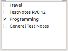
A TCheckListBox ![]() is a component that shows a (scrollable) list of checkboxes where user can make multiple selections. It is available from the Additional tab of the Component Palette.
is a component that shows a (scrollable) list of checkboxes where user can make multiple selections. It is available from the Additional tab of the Component Palette.
Usage
Think of TCheckListBox as having two parts, the strings in a TListBox shown to the right and the checkboxes to the left. The strings are typically descriptions of what the user is selecting if they click a checkbox. The strings may be loaded individually using (eg) -
CheckListBox1.AddItem('Line One', Nil);
CheckListBox1.AddItem('Line Two', Nil);
Or you can assign an existing string list filled elsewhere -
CheckListBox1.Items.Assign(MyStringList);
Its a good idea to then put the checkboxes in a know state -
    for I := 0 to CheckListBox1.Count-1 do
        CheckListBox1.Checked[I] := False;
TCheckListBox allows the user to select as many or as few checkboxes as they like. Use the OnItemClick event to force no more than one -
procedure TNoteBookPick.CheckListBox1ItemClick(Sender: TObject; Index: integer);
var
	I : integer;
begin
    if (Sender as TCheckListBox).Checked[Index] then begin
        for I := 0 to CheckListBox1.Count -1 do
            CheckListBox1.Checked[I] := False;
        CheckListBox1.Checked[Index] := True;
    end;
end;
To read the Check Boxes when (eg) the user has finished -
    for I := 0 to CheckListBox1.Count -1 do
        if CheckListBox1.Checked[I] then DebugLn('Checked Item ' + CheckListBox1.Items[I]);
Comparison with TCheckGroup
There is a similar control named TCheckGroup on Standard component pallette tab. The differences are
1) The items within TCheckGroup are spaced evenly, while TCheckListBox allows scroll down.
2) TCheckListBox has property of AllowGrayed.
See also
