Lazarus Custom Drawn Controls
│
English (en) │
русский (ru) │
The Lazarus Custom Drawn Controls are a set of controls equivalent to the standard Lazarus controls, but which draw themselves. They can have many uses, including the ability to fully customize the drawing, the ability to have exactly the same look in different platforms and also a higher consistency of behavior.
This set of controls is divided into two parts:
- the custom drawn controls which are necessary for implementing Lazarus widgetsets and are located in the unit lazarus/lcl/customdrawncontrols.pas. These are described here.
- all other custom drawn controls, which are used often, but aren't indispensable to implement a LCL custom drawn widgetset. Those are located in the package lazarus/components/customdrawn. These are described in the page Lazarus Custom Drawn Package
How start using these components?
To be able to use them in the Lazarus GUI designer install the package lazarus/components/customdrawn.lpk
To only create customdrawn components by code one can simply add customdrawncontrols, customdrawndrawers and customdrawn_common to the uses clause, declare them and use them. Note that currently only the Win2000 drawer is in the LCL, so any other drawers need to be obtained from the package customdrawn.lpk
It is important to note that styles are only available if you add the corresponding unit of the style to the uses clause.
How do these components work?
The basic programming technique utilized by this set of controls is explained at the Developing with Graphics#Create a custom control which draws itself page.
The code of the controls itself is implemented in the unit customdrawncontrols.pas, but this unit has no drawing code at all. Customdrawncontrols.pas provides the code which processes all the control's keyboard and mouse events, implementing all the mouse and key response behaviour. Each control instance has a Drawer connected to it. A Drawer in our nomenclature (an instance of the TCDDrawer class) is similar to a theme rendering engine or suchlike. The unit customdrawndrawers.pas manages the list of all known drawers and it also declares all the basic data types needed for State and StateEx. These properties contain all the information about the control's current state, which is passed to the drawer so that it can have the information it requires to draw the control correctly. Only one instance of each drawer can exist in a program, and all controls refer to that single instance through the drawer's manager in customdrawndrawers.pas. Each control has a property called DrawStyle which allows you to choose (from an enumerated type) which draw style to use, and then customdrawndrawers.pas converts this information into a Drawer instance. You can specify the dsDefault DrawStyle which will then use the style specified in the global variable DefaultStyle. This was done to allow the style of all controls to be changed at once. Simply change this global variable and then call Invalidate on the controls. You can see below a code snippet from customdrawndrawers.pas which shows the methods which have been exposed to manage the list of drawers and also the Default style:
unit customdrawndrawers;
//...
  TCDDrawStyle = (
    // The default is given by the DefaultStyle global variable
    // Don't implement anything for this drawer
    dsDefault = 0,
    // This is a common drawer, the base for all others. It implements the look from dsWin2000
    dsCommon,
    // Operating system styles
    dsWinCE, dsWin2000, dsWinXP,
    dsKDEPlastique, dsGNOME, dsMacOSX,
    dsAndroid,
    // Other special styles for the user
    dsExtra1, dsExtra2, dsExtra3, dsExtra4, dsExtra5,
    dsExtra6, dsExtra7, dsExtra8, dsExtra9, dsExtra10
    );
//...
procedure RegisterDrawer(ADrawer: TCDDrawer; AStyle: TCDDrawStyle);
function GetDefaultDrawer: TCDDrawer;
function GetDrawer(AStyle: TCDDrawStyle): TCDDrawer;

var
  DefaultStyle: TCDDrawStyle = dsCommon; // For now default to the most complete one, later per platform
Each Drawer class has methods to draw all controls and also all available primitives. All new drawers created by users should inherit from the class TCDCommonDrawer (which is the basic common drawer declared in the unit customdrawn_common.pas). If you don't inherit from TCDCommonDrawer your application might crash if it hits an abstract method. This is the most complete drawer, which implements all abstract methods from its base class, so inheriting from it guarantees that there will never be crashes owing to methods you have not yet implemented. Other drawers can override the desired methods to change the drawing style.
The dsCommon drawer uses only TCanvas for all its rendering, but other themes might also use TLazIntfImage and TFPImageCanvas instead, in order to have a faster pixel access. This programming technique is described in Developing with Graphics#Working with TLazIntfImage.
Color Palette
Drawers have also access to a color Palette, which has the usual LCL system colors. Default drawers will load their colors from the operating system via the LCL acording to the native platform. However, outside their native platform, drawers will use a standard color palette.
  TCDColorPalette = class
  public
    ScrollBar, Background, ActiveCaption, InactiveCaption,
    Menu, Window, WindowFrame, MenuText, WindowText, CaptionText,
    ActiveBorder, InactiveBorder, AppWorkspace, Highlight, HighlightText,
    BtnFace, BtnShadow, GrayText, BtnText, InactiveCaptionText,
    BtnHighlight, color3DDkShadow, color3DLight, InfoText, InfoBk,
    //
    HotLight, GradientActiveCaption, GradientInactiveCaption,
    MenuHighlight, MenuBar, Form: TColor;
  end;

  { There are 5 possible sources of input for color palettes:
   palDefault  - Uses palNative when the operating system matches the drawer style,
                 palFallback otherwise
   palNative   - Obtain from the operating system
   palFallback - Use the fallback colors of the drawer
   palUserConfig-Load it from the user configuration files, ToDo
   palCustom   - The user application has set its own palette
  }
  TCDPaletteKind = (palDefault, palNative, palFallback, palUserConfig, palCustom);

  { TCDDrawer }

  TCDDrawer = class
  protected
  public
    Palette: TCDColorPalette;
    constructor Create; virtual;
    destructor Destroy; override;
    procedure SetPaletteKind(APaletteKind: TCDPaletteKind);
    procedure LoadNativePaletteColors;
    procedure LoadFallbackPaletteColors; virtual;
As the code above shows, you can choose where the colors should come from - either from the operating system current theme, from the drawer's default, or from a user-defined scheme provided by your application. This allows you to change all yor application's colors at runtime simply by changing the palette.
The Drawers
dsCommon
This is the base drawer for all others and it implements a Win2000-look with some small improvements, like better focus drawings on controls
dsWinCE
Imitates the Windows CE look, with some small improvements like better focus drawings on controls
dsWin2000
Imitates the Windows 2000 look. Since dsCommon provides the Windows 2000 look already, this class implements no methods at all
dsWinXP
Imitates the Windows XP look
dsKDEPlastique
Imitates the look of the Plastique Qt/KDE Theme
dsAndroid
Imitates the Android look
dsWindows7
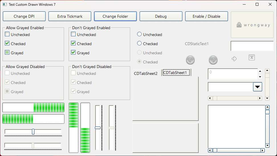
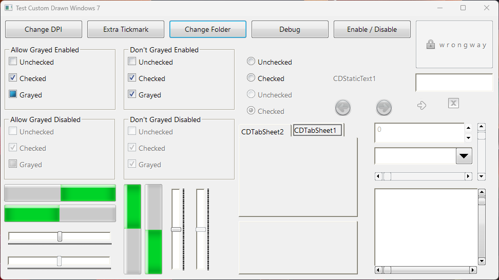
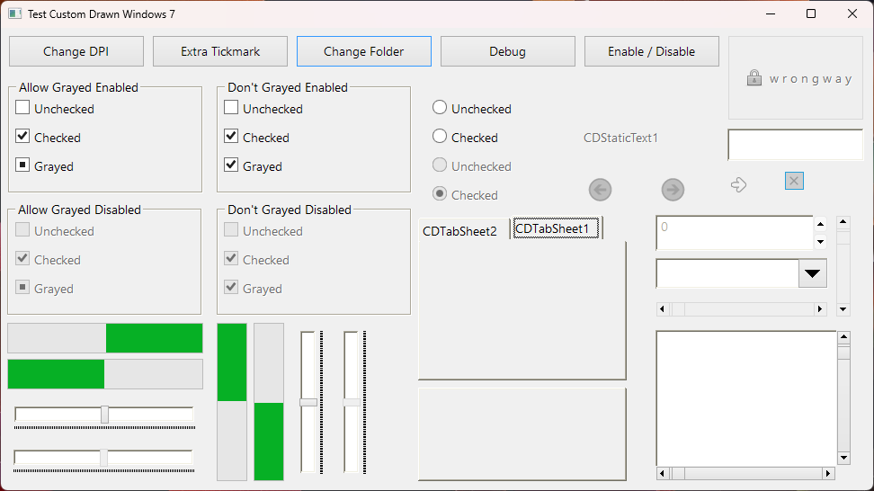
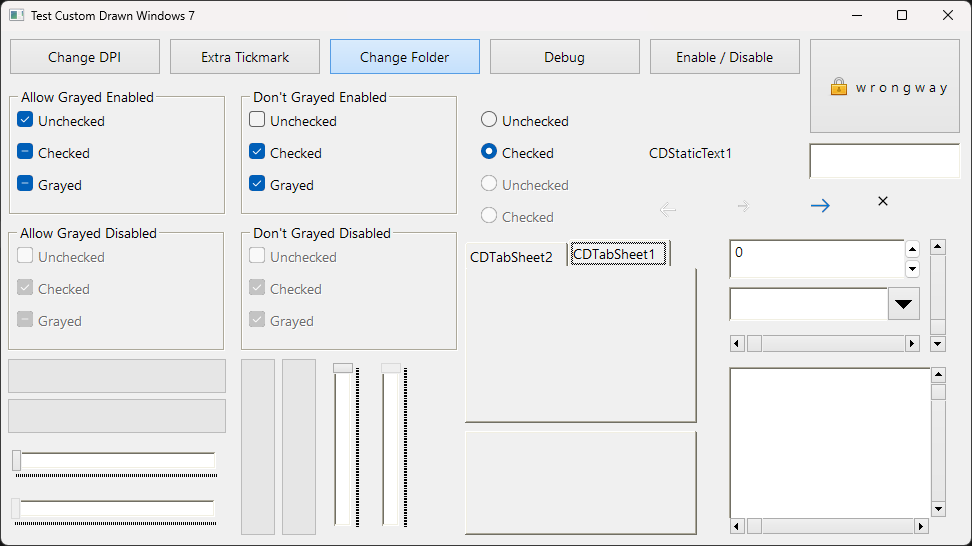
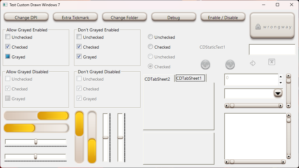
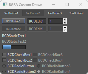
Imitates the Windows look. Currently is available only with BGRABitmap graphic library, and you can get this drawer in the BGRAControls package: BGRAControls
BGRAControls Custom Drawn default style
Controls which imitate the Standard Palette
TCDButton
This is a fully custom drawn button.
Usage example:
uses customdrawnextras;

procedure TForm1.FormCreate(Sender: TObject);
var
  MyButton: TCDButton;
begin
  MyButton := TCDButton.Create(Self);
  MyButton.Parent := Self;
  MyButton.DrawStyle := dsWin2000;
  MyButton.Left := 100;
  MyButton.Top := 100;
  MyButton.Width := 200;
  MyButton.Height := 50;
  MyButton.Caption := 'My Button';
  MyButton.Color := clRed;
  MyButton.OnClick := @HandleButtonClick;
end;
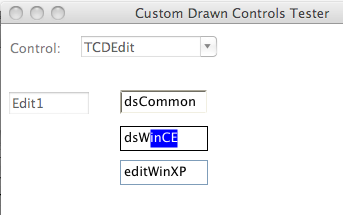
TCDEdit
This is a fully custom drawn edit control.
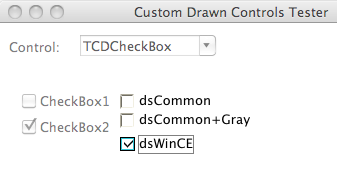
TCDCheckBox
This is a fully custom drawn check box.
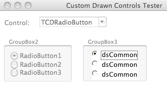
TCDRadioButton
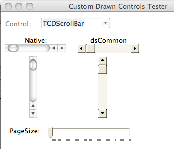
TCDScrollBar
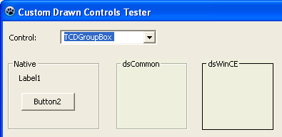
TCDGroupBox
This is a fully custom drawn group box.
Controls which imitate the Additional Palette
TCDStaticText
Controls which imitate the Common Controls Palette
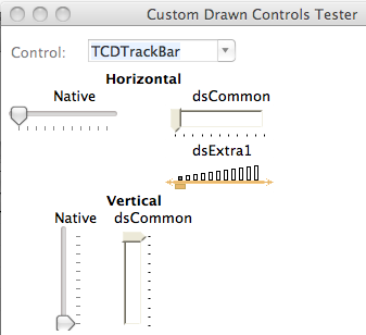
TCDTrackBar
A substitute for TTrackBar
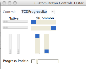
TCDProgressBar
TCDListView
Under construction.
TCDTabControl
A substitute for TTabControl
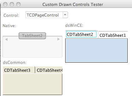
TCDPageControl
A substitute for TPageControl
Custom Drawn Packages
Moved here: Lazarus Custom Drawn Package
Other good custom drawn components for Lazarus
Maintainers
- Felipe Monteiro de Carvalho
- JiXian Yang
