TAChart Tutorial: Stacked BarSeries
│
English (en) │
suomi (fi) │
Introduction
In the BarSeries tutorial we had demonstrated how to create a chart with bar series arranged in a side-by-side manner. Stacked bars are another popular variant of bar charts where the grouped data are stacked onto each other. In this way, the individual contributions and their sum can be shown within the same plot. There is also a variant in which the total bar heights are normalized to 100% to emphasize the relative contributions [1].
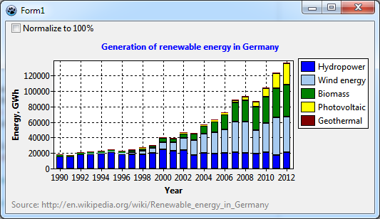
We'll apply this technique in the current tutorial to plot the progress in generation of renewable energies in Germany between 1990 and 2012; the data are taken from wikipedia and cover hydropower, wind energy, energy from bio mass, photovoltaics, and geothermal energy.
Besides TBarSeries you'll meet TRandomChartSource, TCalculatedChartSource, and TChartStyles in this tutorial unit.
As usual, you must have some basic knowledge of Lazarus, Object Pascal, and the key concepts of TAChart to follow the tutorial. If you have never worked with bar charts it is a good idea to look at the related tutorial explaining the side-by-side arrangement of bars. For additional reading we recommend the TAChart documentation.
Designing the chart with random data
Preparations
Create a new project. Add a TAChart component, and align it to alClient to completely fill the form. Maybe you should increase the size of the form a bit, but you can do this later when you see the data.
Before using the "real data" we'll arrange and format the chart to our liking. For this purpose it is advantageous to get a quick response to the changes made in the object inspector. Therefore, we propose to use a TRandomChartSource linked to the BarSeries. A RandomChartSource just produces random data, but is a great helper to to optimize the appearence of the chart without having to recompile the project again and again. Of course, at the end, we will remove the RandomChartSource and replace it with the data of interest.
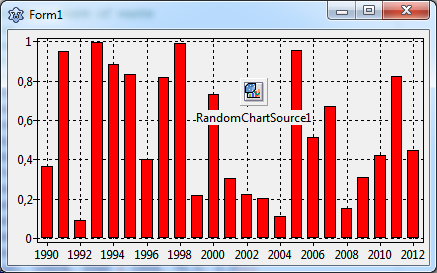
So, let's start: Add a TBarSeries and a TRandomChartSource to the form, and link the RandomChartSource to the Source property of the BarSeries. (If you need more details have a look at the other BarSeries tutorial). Select the RandomChartSource, and set XMin to 1990 and XMax to 2012 (which is the range of our original data in the wikipedia article). In total, these are 23 years, so you set PointsNumber to 23 in order to get a bar for each year. Finally, set YMax to 1 (or any other numbers that you prefer). Now a bar series pops into the chart:
Multiple y values
If you had read the other BarSeries tutorial you may be surprised now: In that tutorial, we had used a single series for each group of bars. In our final renewable energy plot there will be several types of bars, one for each energy kind. So, shouldn't we add some more series?
No. We only need one since we cannot follow the strategy of the side-by-side series here. This is because TAChart cannot stack the bars of different series onto each other. Each bar is drawn from a common "zero level" up (or down) to the data value - no way to shift the next bar up to the end of the previous bar.
What to do?
For stacking of series, TAChart offers the special concept of multiple y values per series data point. If you look into unit TACustomSource you'll find the record
type
  TChartDataItem = packed record
  public
    X, Y: Double;
    Color: TChartColor;
    Text: String;
    YList: TDoubleDynArray;
    ...
  end;
This is the internal structure of the data plotted in a series. Besides the usual x and y coordinates that you know from other plot types and tutorials, there is also a data field YList which reserves storage for additional y values. The chart source provides the property YCount to define the length of the array YList - select the RandomChartSource and have a look at the Object Inspector. But you should know that YCount includes also the standard y value, the length of the YList array for the other y values, therefore, is YCount-1.
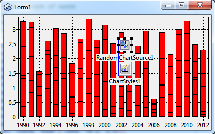
Our final plot will contain five column types ("hydro power", "wind energy", "bio mass", "photo-voltaics", and "geothermal"). Therefore, enter 5 for YCount. This creates stacks of five bars.
Using ChartStyles
Unfortunately, all bars are in the same color. How can we modify the color of each bar level?
We need another component to address this: ChartStyles. This is a collection of TChartStyle components which allow to modify the appearance ("style") of each set of bars.
Go to the component palette, find the 9th icon (the one with the brush in front of the colored bars), and add the component to the form.
At first you have to link the BarSeries to the ChartStyles component. The series has a corresponding property Styles for this purpose.
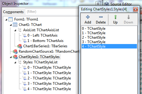
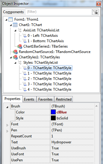
Then, select the component, and go to its Styles property in the object inspector. Click on the ellipsis button "..." to open the ChartStyles editor. Here you can add a style for each group of bars by clicking on the "+" button five times. Alternatively you can right-click on the "Styles" node in the object tree of ChartStyles1 and select "Add item".
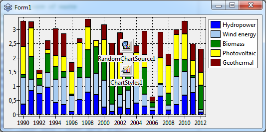
In the the ChartStyle editor you can select each style and you'll see the style's properties in the object inspector. The TChartStyle item with the index 0 belongs to the bottom-most bar, index 1 belongs to the next bar, etc. For changing the color of the bars, modify the Brush.Color of the style. The chart immediately updates and displays the corresponding bar in the new color. Repeat this with the other styles. Have a look at the other properties of the TChartStyle to learn what else can be adapted.
Showing ChartStyles in the legend
Using the ChartStyle property Text you can assign a legend item for each bar level. Set Text to "Hydropower", "Wind energy", "Bio mass", "Photovoltaic", and "Geothermal" for the styles, starting with index 0.
In order to show the legend you know that you have to set the chart's Legend.Visible property to true; it is false by default. The legend, however, displays only a single entry, a red box corresponding to the bar series without usage of ChartStyles. In order to correct that, select the BarSeries, and open the node Legend in the object inspector. The property Legend.Multiplicity is still at lmSingle which produces only a single legend item per series. Change it to lmStyle instead. This is the correct setting when the series uses styles. Now the chart reads the Text values of each style and adds them to the legend.
Normalizing bar stacks to 100%
In order to emphasize the evolution of the relative contributions of the individual bar groups stacked bar charts are often normalized to 100%, i.e. each bar value is replaced by its percentage of the total stack heights.
TAChart can do this with a little modification of the current program. The key ingredient is usage of a TCalculatedChartSource which picks up the data from the currently used chart source and calculates the relative contributions.
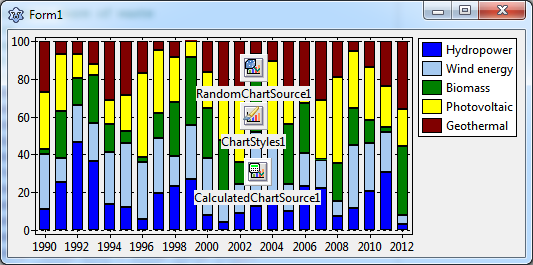
Add a TCalculatedChartSource to the form. Set its property Origin to point to our RandomChartSource. This means that the CalculatedChartSource will perform its calculations based on the data of our chart. It is important that you leave AccumulationMethod at its default, camNone, which means that the input data are passed to the output unchanged. The other options would combine input data values to new values: camAverage, for example, would cause calculation of the average of the data points within the AccumulationRange. But how do we get the percentage calculation if camNone does not change anything? Simple - there is a Percentage property! The normalization is applied after the accumulation calculations. Set Percentage to true.
We don't see a change in the chart yet, because the series still gets its data from the RandomChartSource. Go to the BarSeries and select the CalculatedChartSource as Source.
Here we are!
Plotting real data
Now that the chart is practically finished it's getting time to remove the random data and replace them with the "real data". As noted in the introduction, we want to plot the evolution of renewable energy generation during various years. The data can be found at the end of the wikipedia article.
At first, do the bravery test: delete the RandomChartSource, we don't need it any more - all the previous data are gone, and the chart becomes empty...
How do we get the new data to the series?
Providing real data to the bar series
Add a TListChartSource to the form. It will house the data. Please remember that every data point consists of five y values in our project. Therefore, you must set the YCount property of this chart source to 5 again. To put the multiple y data into the list source it has a method AddXYList where you can specify all y values at once.
function TListChartSource.AddXYList(
  AX: Double; const AY: array of Double;
  const ALabel: String = '';
  AColor: TChartColor = clTAColor): Integer;
But don't forget that the count of Double array elements must match the YCount specified.
For simplicity we type the data from the wikipedia page and call AddXYList in the OnCreate event of the form:
procedure TForm1.FormCreate(Sender: TObject);
begin
  with ListChartSource1 do begin
    // Y0 = Hydropower
    // Y1 = Wind energy (off-shore + on-shore)
    // Y2 = Biomass + biogenic share of waste
    // Y3 = Photovoltaics
    // Y4 = Geothermal energy
    // all values in GWh
    // source: http://en.wikipedia.org/wiki/Renewable_energy_in_Germany
    AddXYList(1990, [15580, 71, 221+1213, 0.6, 0]);
    AddXYList(1991, [15402, 100, 260+1211, 1.6, 0]);
    AddXYList(1992, [18091, 275, 296+1262, 3.2, 0]);
    AddXYList(1993, [18526, 600, 433+1203, 5.8, 0]);
    AddXYList(1994, [19501, 909, 569+1306, 8, 0]);
    AddXYList(1995, [20747, 1500, 665+1348, 11, 0]);
    AddXYList(1996, [18340, 2032, 759+1343, 16, 0]);
    AddXYList(1997, [18453, 2955, 880+1397,   26, 0]);
    AddXYList(1998, [18452, 4489, 1642+1618, 32, 0]);
    AddXYList(1999, [20686, 5528, 1849+1740,   42, 0]);
    AddXYList(2000, [24867, 9513, 2893+1844, 64, 0]);
    AddXYList(2001, [23241, 10509, 3348+1859, 75, 0]);
    AddXYList(2002, [23662, 15786, 4089+1949, 162, 0]);
    AddXYList(2003, [17722, 18713, 6086+2161, 313, 0]);
    AddXYList(2004, [19910, 25509, 7960+2117, 556, 0.2]);
    AddXYList(2005, [19576, 27229, 10978+3047, 1282, 0.2]);
    AddXYList(2006, [20042, 30710, 14841+3844, 2220, 0.4]);
    AddXYList(2007, [21169, 39713, 19760+4521, 3075, 0.4]);
    AddXYList(2008, [20446, 40574, 22872+4659, 4420, 17.6]);
    AddXYList(2009, [19036, 30602+38, 25989+4352, 6583, 18.8]);
    AddXYList(2010, [20956, 37619+174, 29085+4781, 11683, 27.7]);
    AddXYList(2011, [17674, 48315+568, 31920+5000, 19340, 18.8]);
    AddXYList(2012, [21200, 45325+675, 35950+4900, 28000, 25.4]);
  end;
end;
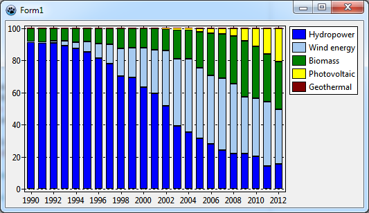
Don't forget to link the ListChartSource it to the Origin of the CalculatedChartsource. Then compile. Here is the output when CalculatedChartSource.Percentage = true:
Refinements
To complete the chart add a title to the axes ("Year" for the horizontal axis, "Energy, GWh" for the vertical axis. In addition, it would be fine to show a title above the chart ("Generation of renewable energy in Germany"), and a footer with the wikipedia reference.
Change to BackColor of the chart to clWhite. Reduce the Margins.Bottom to 0 in order to remove the gap between bars and x axis.
Finally you could add a panel with a checkbox to toggle between "normal" and "percentage" view of the stacked bar chart. Let's leave the code to be assigned to the OnClick event of the checkbox as a home work...
Summary
These are the steps to create a stacked bar chart:
- You need only one series, but it must contain multiple y values
- In the chartsource, set
YCountto the number of stack levels required. - Add data to the chartsource by calling
AddXYList. Be aware that the number of values passed to the array parameter matches theYCountspecified. - Add a
TChartStylescomponent to the form and link it to the properyStyleof the BarSeries - For each stack level, add a
TChartStyle. - Select the color of the stacked bar by means of the corresponding ChartStyle. Moreover, enter the legend text in the field
Textof the ChartStyle. - To show the ChartStyle text entries in the legend use the value
lmStylefor theLegend.Multiplicityof the series. - For creating a normalized stacked bar chart, add a
TCalculatedChartSourceto the form. Link itsOriginproperty to the chartsource providing the data for plotting. Use the CalculatedChartSource asSourceof the series. Set the CalculatedChartSource'sPercentagetotruein order to activate normalization to 100%. - The same methodology can be applied to create stacked area and line series.
- Not mentioned in the text, but the BarSeries of Lazarus v2.0+ exposes a property
Stackedwhich switches between stacked and side-by-side arrangement of the y values. This simplifies the creation of side-by-side bar charts.
Source code
Project file
program project1;

{$mode objfpc}{$H+}

uses
  {$IFDEF UNIX}{$IFDEF UseCThreads}
  cthreads,
  {$ENDIF}{$ENDIF}
  Interfaces, // this includes the LCL widgetset
  Forms, Unit1, tachartlazaruspkg
  { you can add units after this };

{$R *.res}

begin
  RequireDerivedFormResource := True;
  Application.Initialize;
  Application.CreateForm(TForm1, Form1);
  Application.Run;
end.
Unit1.pas
unit Unit1;

{$mode objfpc}{$H+}

interface

uses
  Classes, SysUtils, FileUtil, TAGraph, TASeries, TASources, TAStyles,
  Forms, Controls, Graphics, Dialogs, ExtCtrls, StdCtrls;

type

  { TForm1 }

  TForm1 = class(TForm)
    CalculatedChartSource1: TCalculatedChartSource;
    Chart1: TChart;
    Chart1BarSeries1: TBarSeries;
    ChartStyles1: TChartStyles;
    CheckBox1: TCheckBox;
    ListChartSource1: TListChartSource;
    Panel1: TPanel;
    procedure CheckBox1Click(Sender: TObject);
    procedure FormCreate(Sender: TObject);
  private
    { private declarations }
  public
    { public declarations }
  end;

var
  Form1: TForm1;

implementation

{$R *.lfm}

{ TForm1 }

procedure TForm1.FormCreate(Sender: TObject);
begin
  with ListChartSource1 do begin
    // Y0 = Hydropower
    // Y1 = Wind energy (off-shore + on-shore)
    // Y2 = Biomass + biogenic share of waste
    // Y3 = Photovoltaics
    // Y4 = Geothermal energy
    // all values in GWh
    // source: http://en.wikipedia.org/wiki/Renewable_energy_in_Germany
    AddXYList(1990, [15580, 71, 221+1213, 0.6, 0]);
    AddXYList(1991, [15402, 100, 260+1211, 1.6, 0]);
    AddXYList(1992, [18091, 275, 296+1262, 3.2, 0]);
    AddXYList(1993, [18526, 600, 433+1203, 5.8, 0]);
    AddXYList(1994, [19501, 909, 569+1306, 8, 0]);
    AddXYList(1995, [20747, 1500, 665+1348, 11, 0]);
    AddXYList(1996, [18340, 2032, 759+1343, 16, 0]);
    AddXYList(1997, [18453, 2955, 880+1397,   26, 0]);
    AddXYList(1998, [18452, 4489, 1642+1618, 32, 0]);
    AddXYList(1999, [20686, 5528, 1849+1740,   42, 0]);
    AddXYList(2000, [24867, 9513, 2893+1844, 64, 0]);
    AddXYList(2001, [23241, 10509, 3348+1859, 75, 0]);
    AddXYList(2002, [23662, 15786, 4089+1949, 162, 0]);
    AddXYList(2003, [17722, 18713, 6086+2161, 313, 0]);
    AddXYList(2004, [19910, 25509, 7960+2117, 556, 0.2]);
    AddXYList(2005, [19576, 27229, 10978+3047, 1282, 0.2]);
    AddXYList(2006, [20042, 30710, 14841+3844, 2220, 0.4]);
    AddXYList(2007, [21169, 39713, 19760+4521, 3075, 0.4]);
    AddXYList(2008, [20446, 40574, 22872+4659, 4420, 17.6]);
    AddXYList(2009, [19036, 30602+38, 25989+4352, 6583, 18.8]);
    AddXYList(2010, [20956, 37619+174, 29085+4781, 11683, 27.7]);
    AddXYList(2011, [17674, 48315+568, 31920+5000, 19340, 18.8]);
    AddXYList(2012, [21200, 45325+675, 35950+4900, 28000, 25.4]);
  end;
end;

procedure TForm1.CheckBox1Click(Sender: TObject);
begin
  CalculatedChartSource1.Percentage := Checkbox1.Checked;
  if Checkbox1.Checked then
    Chart1.LeftAxis.Title.Caption := 'Contribution, %'
  else
    Chart1.LeftAxis.Title.Caption := 'Energy, GWh';
end;

end.
Unit1.lfm
object Form1: TForm1
  Left = 596
  Height = 270
  Top = 353
  Width = 517
  Caption = 'Form1'
  ClientHeight = 270
  ClientWidth = 517
  OnCreate = FormCreate
  LCLVersion = '1.3'
  object Chart1: TChart
    Left = 0
    Height = 248
    Top = 22
    Width = 517
    AxisList = <
      item
        Minors = <>
        Title.LabelFont.Orientation = 900
        Title.LabelFont.Style = [fsBold]
        Title.Visible = True
        Title.Caption = 'Energy, GWh'
      end
      item
        Alignment = calBottom
        Minors = <>
        Title.LabelFont.Style = [fsBold]
        Title.Visible = True
        Title.Caption = 'Year'
      end>
    BackColor = clWhite
    Foot.Alignment = taLeftJustify
    Foot.Brush.Color = clBtnFace
    Foot.Font.Color = clGray
    Foot.Text.Strings = (
      'Source: http://en.wikipedia.org/wiki/Renewable_energy_in_Germany'
    )
    Foot.Visible = True
    Legend.Visible = True
    Margins.Bottom = 0
    Title.Brush.Color = clBtnFace
    Title.Font.Color = clBlue
    Title.Font.Style = [fsBold]
    Title.Text.Strings = (
      'Generation of renewable energy in Germany'
    )
    Title.Visible = True
    Align = alClient
    ParentColor = False
    object Chart1BarSeries1: TBarSeries
      Legend.Multiplicity = lmStyle
      BarBrush.Color = clRed
      Source = CalculatedChartSource1
      Styles = ChartStyles1
    end
  end
  object Panel1: TPanel
    Left = 0
    Height = 22
    Top = 0
    Width = 517
    Align = alTop
    BevelOuter = bvNone
    ClientHeight = 22
    ClientWidth = 517
    TabOrder = 1
    object CheckBox1: TCheckBox
      Left = 8
      Height = 19
      Top = 0
      Width = 119
      Caption = 'Normalize to 100%'
      OnClick = CheckBox1Click
      TabOrder = 0
    end
  end
  object ChartStyles1: TChartStyles
    Styles = <
      item
        Brush.Color = clBlue
        Text = 'Hydropower'
      end
      item
        Brush.Color = clSkyBlue
        Text = 'Wind energy'
      end
      item
        Brush.Color = clGreen
        Text = 'Biomass'
      end
      item
        Brush.Color = clYellow
        Text = 'Photovoltaic'
      end
      item
        Brush.Color = clMaroon
        Text = 'Geothermal'
      end>
    left = 336
    top = 96
  end
  object CalculatedChartSource1: TCalculatedChartSource
    Origin = ListChartSource1
    left = 104
    top = 96
  end
  object ListChartSource1: TListChartSource
    YCount = 5
    left = 232
    top = 96
  end
end
