Reference: MSEgui/TFrame
TFrame
The visual appearance of a widget is specified by the properties Face and Frame. Face concerns the widget itself, Frame the appearance around it.
The areas of a widget
An important task of TFrame is the management of the nested rectangular areas of TWidget.
The outermost is TWidget.WidgetRect. The origin of TWidget.WidgetRect.Pos is TWidget.WidgetRect.Pos of the parentwidget. The properties TWidget.Bounds_* refer to WidgetRect. TWidget.Color fills this area. The next is TWidget.PaintRect. Origin is WidgetRect.Pos. TWidget.Face fills this area.
TFrame uses the space between WidgetRect and PaintRect in order to show the widget frame. TFrame descendants use it for the display of frame captions, dropdown buttons, scrollbars...
The next inner is TWidget.ClientRect which normally has the same position and size as PaintRect. Some widgets have a TFrame descendant which provides a ClientRect which is bigger than PaintRect, TScrollBox for example. Painting in client area is clipped by PaintRect.
The innermost area is InnerClientRect, it is the ClientRect deflated by the values of TFrame.FrameI_* properties. Edit-widgets place text in this area.
Reference
Hierarchy
Properties
Caption
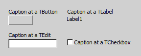
At some widgets the Caption of the frame is a "add on", at TCheckBox it's a essential part of the widget:
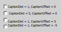
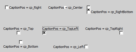
With CaptionDist, CaptionOffset and CaptionsPos you can specify the exact position of the Caption (at TCaptionPos the pic shows only some examples):
captionposty = (cp_center,cp_rightbottom,cp_right,cp_rightcenter,cp_righttop,
                 cp_topright,cp_top,cp_topcenter,cp_topleft,
                 cp_lefttop,cp_left,cp_leftcenter,cp_leftbottom,
                 cp_bottomleft,cp_bottom,cp_bottomcenter,cp_bottomright
                 );

property Caption: msestring
property CaptionDist: integer default 0;
property CaptionOffset: integer default 0;
property CaptionPos: captionposty;
property Font: TOptionalFont;
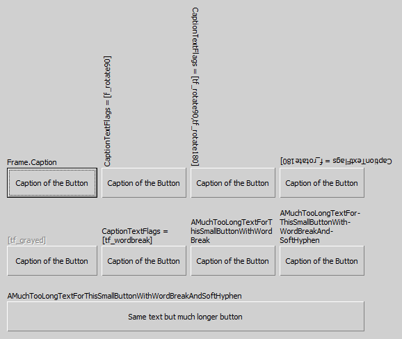
At some widgets the property CaptionTextFlags is existing, allowing to specify some specials for the caption.
If you use tf_wordbreak and the Captions hasn't fitted chars for word break, the word is break at the end of the line. If you want control the position of the word break, use tf_softhyphen and insert in the object inspector (!) soft hyphen chars by typing [173 (at newer IDE versions [s too). This soft hyphen are only visible if they lead to an word break:
Some CaptionTextFlags doesn't matter in combination with TFrame.
FrameImage
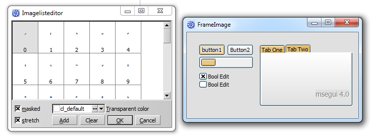
With the property FrameImage you can paint individual frames by using a TImageList. In the imalge list their are used 8 consecutive images. The images for the edges will be stretched as needed - this will look very strange, if this images are not suitable (look TFace.Frameimage).
Usually you will use very small pictures, see the following picture:
property FrameImage_list: timagelist;
    // imagenr 0 = topleft, 1 = left, 2 = bottomleft, 3 = bottom,
    // 4 = bottomright 5 = right, 6 = topright, 7 = top
property FrameImage_offset: integer default 0;
FrameWidth, ColorFrame, Framei, HiddenEdges
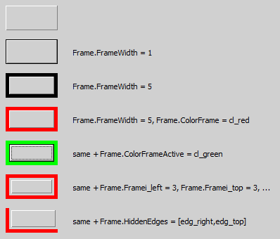
With FrameWidth you specify the thinckness of the frame line. ColorFrame is the color of it, ColorFrameActive the color if the widget is focused. With Framei you specify a distance between the frame and the widget. If you don't want to see all the frame lines, use HiddenEdges.
edgety = (edg_right,edg_top,edg_left,edg_bottom);
edgesty = set of edgety;
framety = record
          case integer of
             0: (left,top,right,bottom: integer);
             1: (topleft,bottomright: sizety);
          end;

property FrameWidth: integer default 0;
property ColorFrame: colorty default cl_default;
property ColorFrameActive: colorty default cl_default;
property HiddenEdges: edgesty default [];
property Framei: framety;
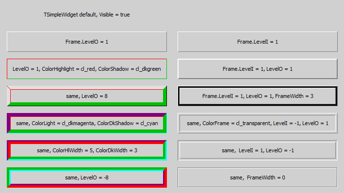
3D-Frames
property ColorDkShadow: colorty default cl_default;
property ColorFrame: colorty default cl_default;
property ColorHighlight: colorty default cl_default;
property ColorLight: colorty default cl_default;
property ColorShadow: colorty default cl_default;

property ColorDkWidth: integer default -1;
property ColorHlWidth: integer default -1;

property FrameWidth: integer default 0;
property LevelI: integer default 0;
property LevelO: integer default 0;
ColorClient and FrameFace
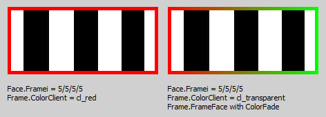
You can fill the complete client area of a frame with the color specified by ColorClient. If the widget has no face, the complete widget is colored. If it has a face, the specified color is only visible, if Face.Framei has values higher than 0.
To respond for the different states of a widget, you can use FrameFace_List. This is a list of TFace definitions, selected by the state of the widget. The different offsets are additive. For example: If the widget has the focus, is neither disabled, clicked nor the mouse is over it, it has the focus, but the form is inactive, the used index of TFaceList is FrameFace_Offset + FrameFace_OffsetFocused. The same widget, now the form active, use the index FrameFace_Offset + FrameFace_OffsetFocused + FrameFace_OffsetActive.
property FrameFace_List: TFaceList;

property FrameFace_Offset: facenrty default 0;
property FrameFace_Offset1: facenrty 0;  //used for default button
property FrameFace_OffsetDisabled: facenrty default 0;
property FrameFace_OffsetMouse: facenrty default 0;
property FrameFace_OffsetClicked: facenrty default 0;
property FrameFace_OffsetActive: facenrty default 0;
property FrameFace_OffsetFocused: facenrty 0;
Font
See TFont
Template, LocalProps, LocalProps1 and OptionsSkin
You can assign Template to a TFrameComp-instance to take the frame settings of this non-visual component.
If a special property of TFrame should not specified by Template but the local TFrame-settings, use LocalProps or LocalProps1 to except this property of template settings for this widget.
To differ from the used skin, use OptionsSkin.
Options
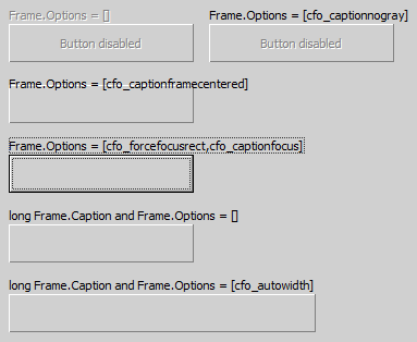
To tune the look of the frame use Options:
cfo_autowidth ensures the widget is as long as the Frame.Caption is.
Methods
Events
Known issues
Issues of the class
Issues of this documentation
- Some Options are not described
- The class hierarchy isn't depict
